I am sure that I am not the only one in this country who gets an almost daily allotment of emails from many of my GOP friends telling me how much Obama has increased the deficit and that his stimulus plan did not do any good for the country’s job creation. Oh yes, let us not forget the one email telling us how much Obama has been spending.
The cure for these kinds of emails, other than listing them as spam? Hit these misinformed lunatics with the facts, even though it seems that right-wingers are allergic to the truth.
There are 3 charts with some facts that you can reply to your in-laws and friends with. See how ell they handle the “ reality based “ information.
Keep in mind that when you send these to your ignorant friends that they are probably addicted Fox News viewers who cannot stand the fact that a black man is your President.
Spending
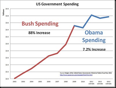
Government spending increased dramatically under Bush. It has not increased much under Obama. Note that this chart does not reflect any spending cuts resulting from deficit-cutting deals.
Deficits
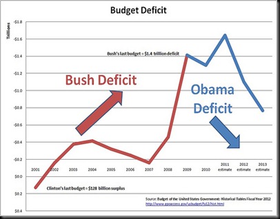
Notes, this chart includes Clinton's last budget year for comparison.
The numbers in these two charts come from Budget of the United States Government: Historical Tables Fiscal Year 2012. They are just the amounts that the government spent and borrowed, period, Anyone can go look then up. People who claim that Obama "tripled the deficit" are either misled or are trying to mislead.
The Stimulus and Jobs
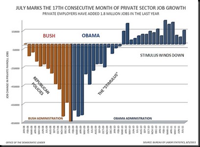
In this chart, the RED lines on the left side -- the ones that keep doing DOWN -- show what happened to jobs under the policies of Bush and the Republicans. We were losing lots and lots of jobs every month, and it was getting worse and worse. The BLUE lines -- the ones that just go UP -- show what happened to jobs when the stimulus was in effect. We stopped losing jobs and started gaining jobs, and it was getting better and better. The leveling off on the right side of the chart shows what happened as the stimulus started to wind down: job creation leveled off at too low a level.
It looks a lot like the stimulus reversed what was going on before the stimulus.
Conclusion: THE STIMULUS WORKED BUT WAS NOT ENOUGH!
Thanks go to davej for these charts.


0 Comments:
Post a Comment